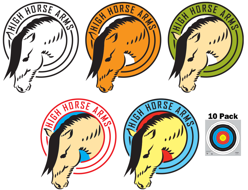
The client was looking for a mark that felt vintage but had some originality to it. He didn't want it to look like a sports logo, but he did want something that would look good on a hat. Hats were popular merchandise for the kinds of events and shows he went to. My process lead me in a couple of directions.
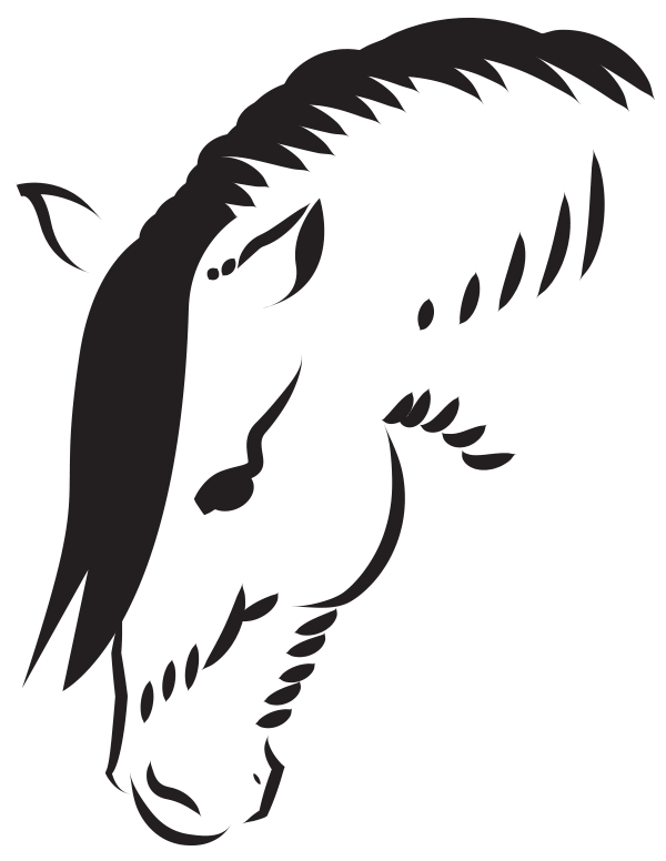
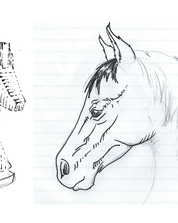
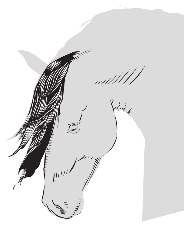
- In the first example, I thought about etchings and attempted to find a way to use thicker line for embroidery. So, I found a head position source photo on the internet and started playing with pen and paper to try and balance detail. Then, I took to Illustrator and just made what I wanted out of the theme and position. I reimagined that illustration using a much thicker stroke while trying to keep some semblance of detail. Finally, I tried various color combinations.
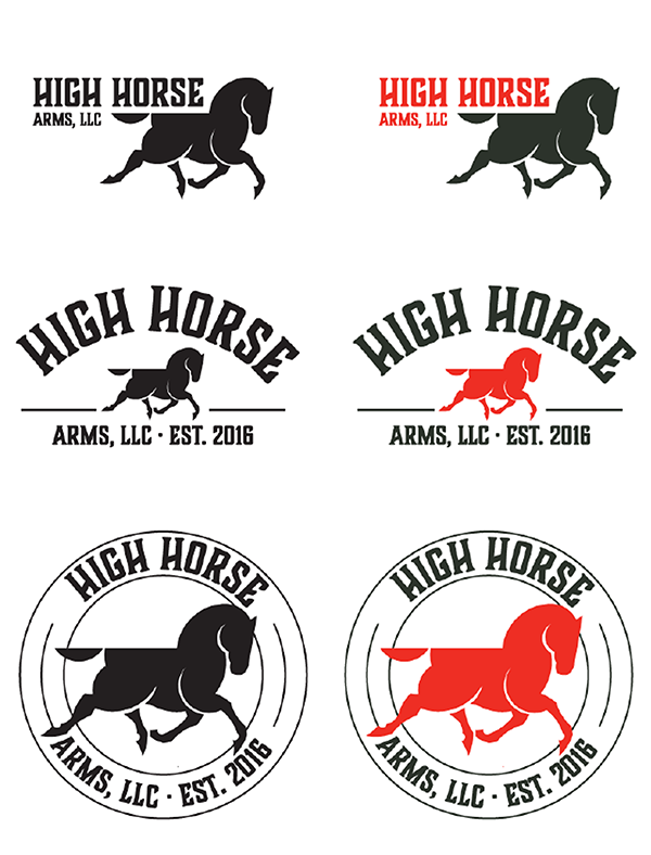
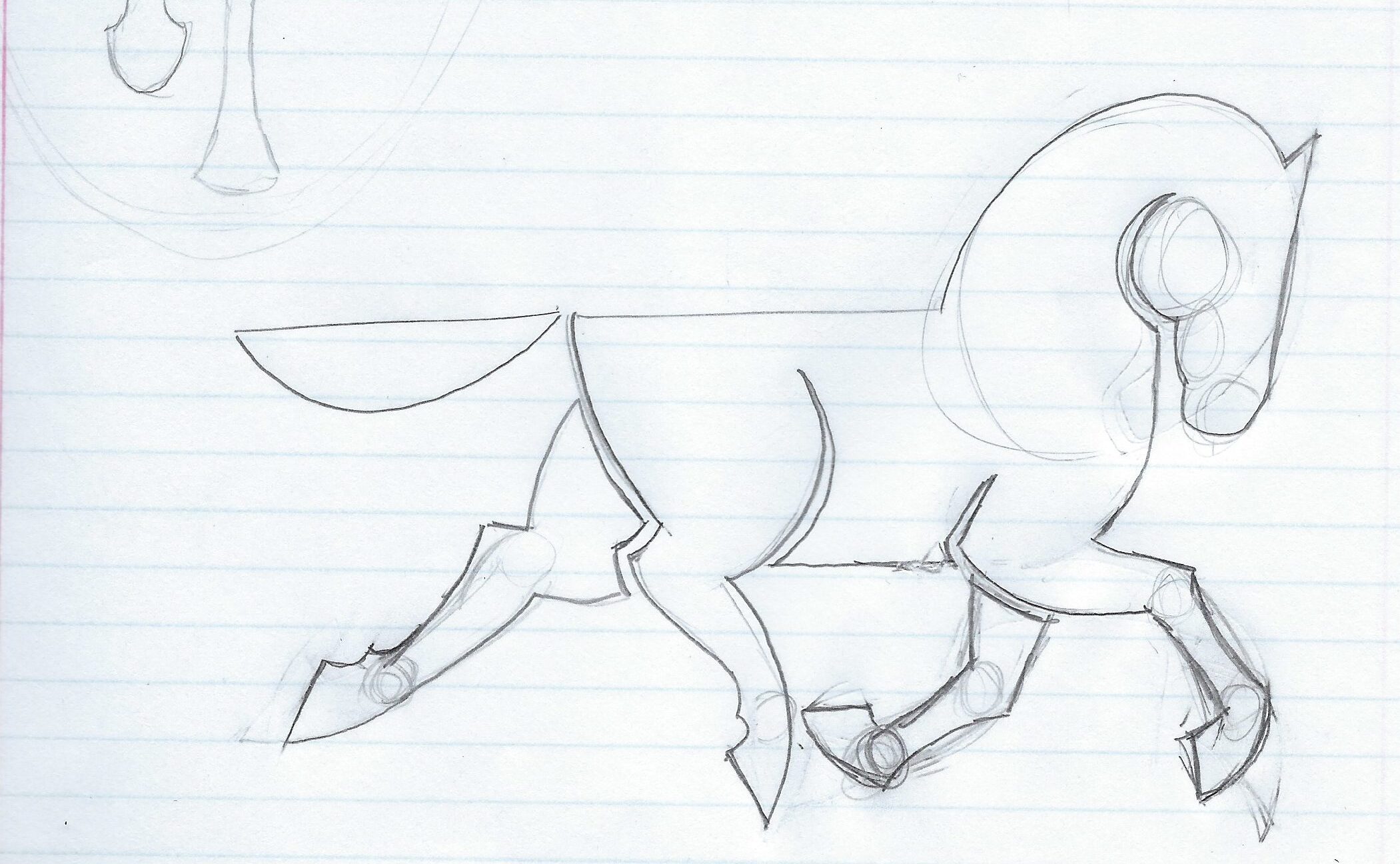
- Thinking about vintage horse logos brought me to the 1950s Mobilgas logo and really I just wanted to try my hand at something vaguely similar. I tried sketching the horse in various positions but found a style and position I really liked. I translated it to Illustrator and fixed the horse's gate so his feet were in a stride a horse would actually take. Then, I gave it a couple of different treatments and color combinations, in the second example.